
Infographics - Electronics Production Trends of India
Greetings! In last couple of weeks, I have picked up Microsoft Power BI. It’s fun to do quick visualizations on the fly, using Microsoft Power BI desktop version. It’s an easy handy tool, to create high-definition visual story. Previously, i relied heavily on D3.js and DC.js (for cross filtering) to create many custom infographics and visualizations. Although, during most of my work-related visualizations I rely mostly on the matplotlib and seaborn, integrated into the Jupyter notebook workflow.
With the changing trends of rapid exploration and visualizations, Power BI desktop, seems to have a sweet spot. It comes in-built with many charts but also can integrate with R and python charting libraries. I still must try my hand on Python integration with Power BI (maybe a correlation plot would be good to start; something for next time). Power BI desktop is available for free here .
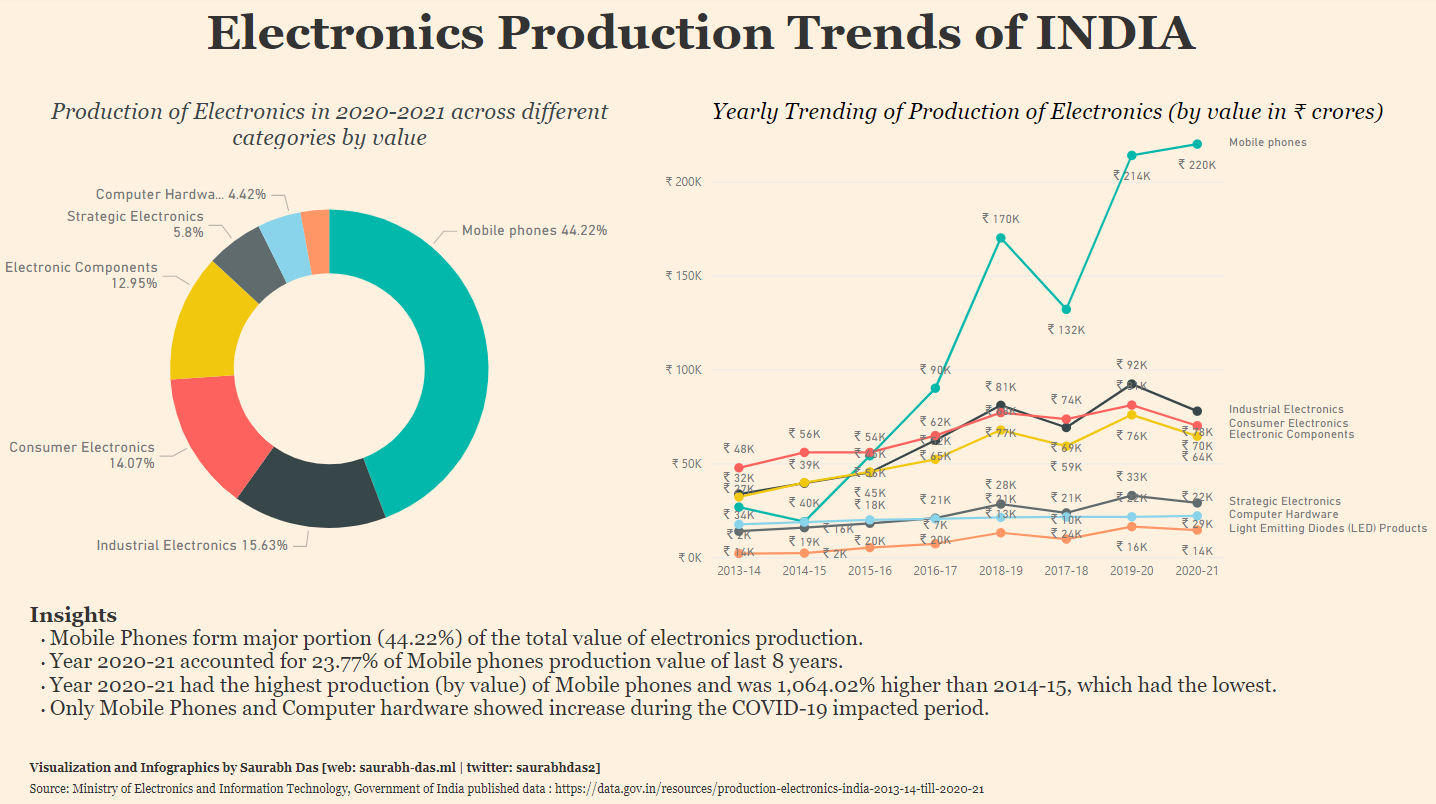
Seen above is my attempt to Infographic on created on Electronics production Trends in India. The data was sourced from India’s Open Government Data (OGD) Platform (data.gov.in). It’s a treasure trove of datasets and APIs. Many of them updated at periodic frequency, including real-time. The design and color scheme was my small attempt to replicate Financial Times visualization scheme.
The infographic shows how Government’s impetus and policy push to electronic manufacturing industry has shown increasing growth trends. Inspite of COVID-19 pandemic impacted fiscal year 2020-2021 (Apr-Mar), India was able to produce INR 4.97 lakh crore (~$66 billion) worth of electronics. As expected, increasing demand of mobile phones and computer hardware, as part of Work from Home (WFH) model helped ensuring uptake in increasing domestic production. Such has been the mobile phone manufacturing that nearly 1/4th worth of total mobile phones manufactured in India in past 8 years was done in the FY 2020-2021.
Keep safe, and look forward to a new infographic, with insights.